Warbler
David Jonathan Ross · David Jonathan Ross
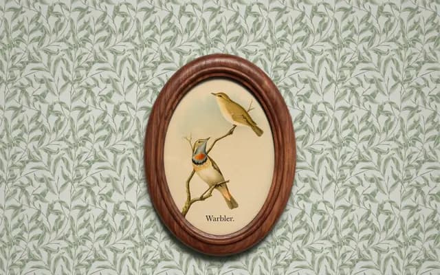
A revival of William Martin's 1790 types for William Bulmer, developed across four optical sizes tuned for Banner, Display, Deck and Text settings.
About
Drawing on the gentle, high-contrast letterforms that bridge Baskerville and Bodoni, Warbler captures Martin's subtle idiosyncrasies — the swing of the a, the low waist of the k, the slight backward lean of the g — calibrating them at each optical size so they read as characterful rather than caricatured. The family spans four size-specific variants from Banner to Text, each adjusting stroke contrast, proportions and the scale of details such as ball terminals accordingly. With only two weights and a deliberate restraint in the overall system, it makes hierarchy a matter of size rather than weight.
Classification
Warbler follows the types of William Martin cut in 1790, which bridge Baskerville and Bodoni — more condensed and contrasty than Baskerville but less mechanical than Bodoni, placing it squarely in the transitional serif category.