Hooke
Death of Typography · Lee Yun Xuan
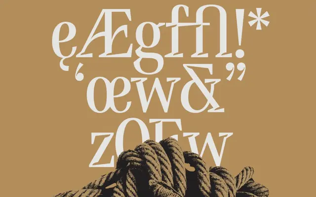
A single-weight condensed display serif whose sharp ink traps, elongated terminals and curved bars all take formal cues from the anatomy of a fishing hook.
About
Designed by Lee Yun Xuan under Death of Typography's Font Incubation Programme, Hooke translates the functional geometry of hooks into typographic detail: the serifs carry notched cutouts referencing a barb, terminals are elongated to echo a hook's throat, and the bars curve to suggest motion. The high thick-thin contrast and condensed proportions make it most effective at large sizes where those fine details read clearly. It suits editorial headlines, poster work or branding that calls for a distinctive and somewhat dramatic serif voice.
Classification
A single-weight condensed serif with pronounced thick-thin contrast, sharp terminals and hook-inspired details; the extreme contrast and condensed proportions place it firmly in display rather than text use.