Richmond
Delve Fonts · Jim Parkinson
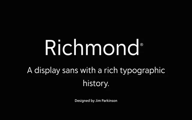
A geometric sans family by Jim Parkinson, drawing on the Metro and Erbar tradition, built across 21 styles with condensed cuts and ornamented capitals for display use.
About
Designed by Jim Parkinson following years of bespoke newspaper sans work, Richmond takes the geometric tradition of Dwiggins' Metro, Erbar and Johnston's Underground type as its reference point. The family spans 21 styles, adding normal-width upright and italic cuts to the condensed weights Parkinson had typically been commissioned to draw for editorial clients. Ornamented capitals are included alongside case-sensitive forms, fractions and localised forms, making it flexible across both newspaper headlines and broader display applications.
Classification
Richmond is described as a geometric sans display family, with acknowledged debts to Metro, Erbar and Johnston's Underground type. Its primary orientation is headlines and display use, with both upright and italic widths plus condensed variants and ornamented capitals.