Tuppence
Delve Fonts · Roberto de Vicq de Cumptich · 2021
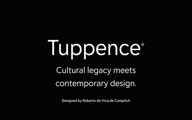
A reinterpretation of the Victorian reversed-contrast typeface Blackfriars, refined by Roberto de Vicq de Cumptich with wider proportions and additional weights for contemporary display use.
About
Drawing from the Stephenson Blake foundry's Blackfriars, de Vicq de Cumptich reworked the original into a more graceful, geometrically proportioned design suited to modern applications. The family runs across six weights from ExtraLight to Bold, each with a matching italic, and a variable font covers the full weight axis in both upright and italic. An extensive suite of ornaments, swash capitals, catch words and ligatures extends its usefulness into food and beverage packaging, poster work and restaurant branding.
Classification
Tuppence uses reversed contrast, a hallmark of Victorian-era display type, derived from the Stephenson Blake typeface Blackfriars. Its ornamental features, catch words, swash capitals and wide proportions place it firmly in the display category.