Diatype
Dinamo Typefaces · Johannes Breyer & Fabian Harb, with Elias Hanzer, Erkin Karamemet, Renan Rosatti, Andree Paat, Đức Cao
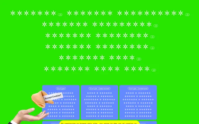
A warm, screen-optimised grotesque from Dinamo, spanning seven width variants, a mono cut and ten script systems from Arabic to Hangul.
About
Taking its name from the pre-digital Diatype typesetting machine, this grotesque blends Swiss Neo-grotesque structure with a warmth suited to extended on-screen reading. Eight weights from Thin to Ultra run across upright and italic in every subfamily, with the family stretching from Compressed through to Extended plus dedicated Mono and Semi Mono cuts. Script coverage is unusually broad for a grotesque, reaching Arabic, Armenian, Devanagari, Cyrillic, Georgian, Greek, Hebrew, Hangul and Thai alongside Latin.
Classification
Dinamo describe it as a warm yet sharp grotesque informed by pre-digital Diatype typesetting machines and the Swiss Neo-grotesque tradition, placing it squarely in the grotesque sans-serif lineage.