Ginto
Dinamo Typefaces · Seb McLauchlan
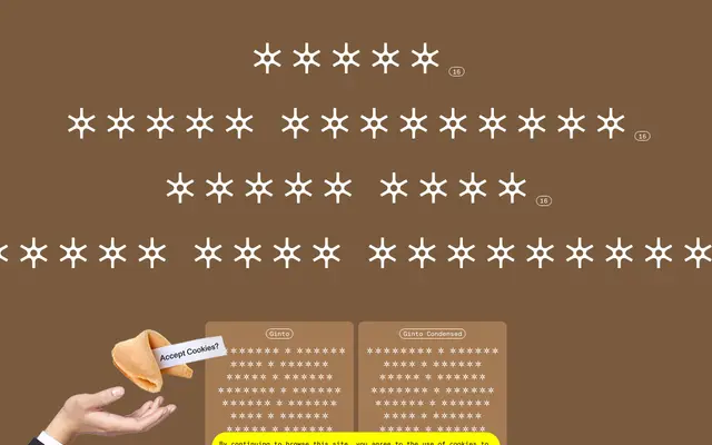
A geometric-humanist sans by Seb McLauchlan that plays strict Modernist geometry against the animated, baroque qualities of 1950s and 60s phototypesetting-era types.
About
Designed by London-based graphic designer Seb McLauchlan, Ginto sits at the intersection of rigorous geometric construction and the looser, more expressive letterforms that emerged during the phototypesetting period. The family spans four sub-families — Ginto, Ginto Condensed, Ginto Nord and Ginto Nord Condensed — each running from Hairline to Ultra across full italics, with Nord extending the x-height and character width for greater visual impact. Script coverage reaches Latin Extended, Greek and Cyrillic, and a variable font is available across all sub-families.
Classification
Dinamo describe Ginto as a geometric-humanist typeface, drawing on strict Modernist geometry and the more baroque, animated styles of phototypesetting-era sans-serifs from the 1950s and 60s.