Ginto Rounded
Dinamo Typefaces · Seb McLauchlan
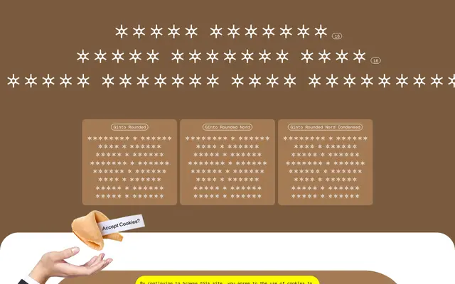
A rounded geometric-humanist sans by Seb McLauchlan that balances soft terminals with Futura-like proportion models across three subfamilies.
About
Drawn with rounded terminals and an interplay between circular geometry and humanist warmth, the family takes cues from animated graphic styles of the 1960s and 70s. Standard Ginto Rounded suits smaller text with a compact lowercase, while Ginto Rounded Nord offers a taller x-height and wider characters for display use; Ginto Rounded Nord Condensed handles tighter settings. A variable font bridges the Nord widths, and the family ships with eight weights plus italics throughout.
Classification
Rounded terminals on a geometric-humanist base draw from circular Futura-adjacent proportion models tempered by softer, more animated 1960s–70s forms, placing it squarely in the geometric humanist sans category with a rounded variant identity.