Gravity
Dinamo Typefaces · Johannes Breyer, Fabian Harb, Robert Janes, Fabiola Mejía, Olga Umpeleva
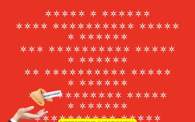
A one-weight headline grotesque in 12 widths, from XXXX Compressed to Wide, with extensive OpenType features for stacking and baseline manipulation.
About
Built on a skeleton drawn from heavy grotesques of the 1960s and 70s, this display typeface spans an extreme range of widths available as individual styles or as a single variable font file. Stylistic alternates allow characters to jump over the baseline or hang from the top, enabling unusually compact and playful title arrangements. Spacing and kerning were handled by Igino Marini, and Cyrillic support is available as a companion release.
Classification
A single-weight, ultra-heavy headline grotesque with 12 width variants spanning XXXX Compressed to Wide, inspired by heavy grotesques of the 1960s and 70s. Its extreme width range and baseline-manipulation features place it firmly in the display category.