Ikarus
Dinamo Typefaces · Fabian Harb, Erkin Karamemet, Johannes Breyer
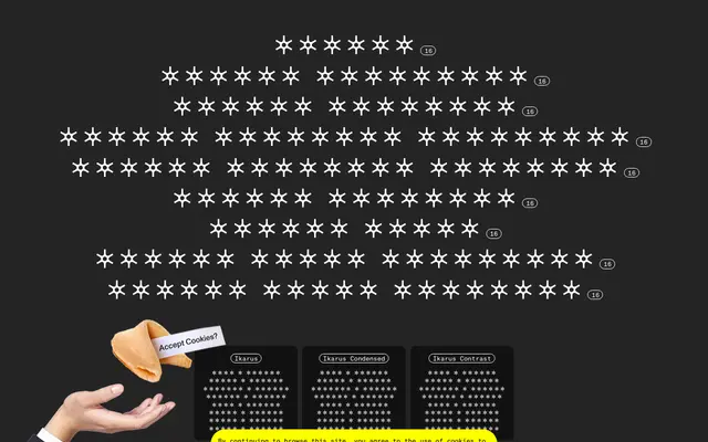
A large humanist family by Dinamo built around wayfinding principles, pairing a monolinear text design with a high-contrast display companion across three widths, eight weights and matching italics.
About
Designed by Fabian Harb, Erkin Karamemet and Johannes Breyer at Dinamo, Ikarus pairs a sturdy monolinear text design with an articulate high-contrast companion for headlines, the two sharing open terminals and clearly distinctive letterforms drawn for readability at distance and in poor light. Nine subfamilies span Condensed, Normal and Extended widths, each running eight weights from Thin to Ultra with matching italics, and the whole system is tied together by a variable font with axes for weight, width, slant and contrast. Spacing and kerning were handled by Igino Marini.
Classification
The monolinear subfamilies are humanist sans-serifs rooted in wayfinding with open terminals and clearly distinctive letterforms; the Contrast subfamilies introduce high-contrast strokes for display use, extending the family into a dual-register system.