Monument Grotesk
Dinamo Typefaces · Kasper-Florio (Larissa Kasper & Rosario Florio), Robert Janes, Fabiola Mejía · 2018
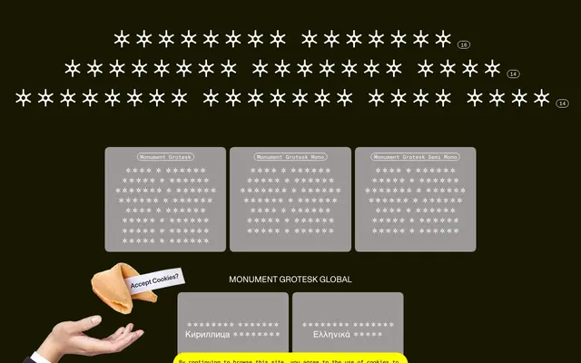
A grotesque rooted in an 1884 Palmer & Rey specimen, reinterpreted by Kasper-Florio and Dinamo with a raw, compact character that has since become a fixture in contemporary editorial and identity work.
About
Originating from a scan of an 1884 Palmer & Rey specimen book, the design was digitised and reinterpreted by Swiss studio Kasper-Florio before being released publicly through Dinamo in 2018. Its compact skeleton, high vertical contrast and sharp end strokes give it a distinctively unrefined quality that reads as confident rather than rough. The family spans eight weights with italics, and extends into Mono and Semi-Mono cuts, with coverage across Latin, Cyrillic and Greek scripts.
Classification
Rooted in a Palmer & Rey 1884 specimen, the design retains the compact skeleton and sharp end strokes of a 19th-century grotesque, digitised and reinterpreted for contemporary use with idiosyncratic, deliberately unpolished character.