Pareto
Dinamo Typefaces · Johannes Breyer, Fabian Harb, Erkin Karamemet
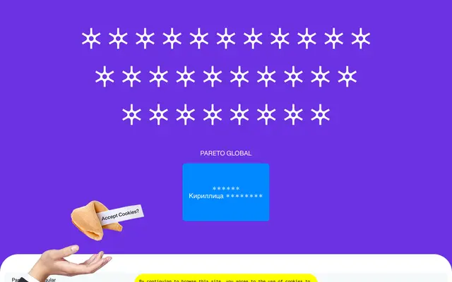
A display slab in three flavours, each defined by a different serif termination shape, rectangular, triangular or circular, sold separately or as a bundle.
About
Designed by Dinamo (Johannes Breyer, Fabian Harb and Erkin Karamemet), Pareto draws on American frontier display type but routes it through a Bauhaus geometric logic, producing three structurally related fonts that share the same skeleton while differing only in serif shape. The three variants can be purchased individually or together, allowing the shapes to be mixed across a layout for a modular, comedic effect. Character coverage spans Latin Extended, Greek and Cyrillic, with spacing and kerning by Igino Marini.
Classification
A chunky slab serif with three interchangeable serif termination styles (rectangular, triangular, circular), drawing from the lineage of American display slabs while filtered through a Bauhaus sensibility.