Repro
Dinamo Typefaces · Erkin Karamemet
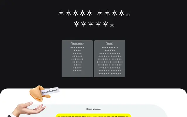
A geometric sans by Erkin Karamemet that pairs nine weights and italics with a monospaced variant, a variable font axis and a built-in circled-glyph system for creating visual hierarchy.
About
Designed by Erkin Karamemet and spaced by Igino Marini, Repro takes cues from signage and digital operating systems while softening the mechanical rigidity typical of geometric sans families. The family ships with nine weights from Hairline to Ultra, matching italics, a full monospaced subfamily and a variable font, making it equally suited to screen interfaces and print. An unusual set of OpenType features includes a circled-emphasis tool, sharp and soft alternates for individual characters, and web-specific glyphs, giving designers considerable control over the typeface's rhythm and character.
Classification
Repro has an overall geometric feel but with softer, more personable qualities; it is explicitly described as a friendly sans inspired by signage and digital operating systems, placing it within the geometric sans tradition.