ROM
Dinamo Typefaces · Seb McLauchlan
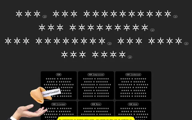
A hybrid grotesque and gothic sans by Seb McLauchlan, taking proportional cues from conceptual art catalogs of the 1960s and 70s and spanning six width subfamilies plus a mono.
About
Designed by graphic designer and type-maker Seb McLauchlan, ROM fuses the rationalised construction of classic Grotesque with raw Gothic details, producing a typeface that shifts between the elegant and the dissonant. The family spans six subfamilies from Compressed to Wide, including a monospaced variant, each offered in seven weights from Light to Black with matching italics, all unified under a single variable font. Caps are wide and generous; lowercase proportions are narrow and refined, a contrast drawn from the typographic language of '60s and '70s conceptual art publishing.
Classification
ROM combines the rational structure of classic Grotesque with raw details drawn from Gothic typefaces, placing it firmly in the grotesque sans-serif tradition with an additional Gothic influence that gives it a distinctive character.