Whyte
Dinamo Typefaces · Fabian Harb, Johannes Breyer, Erkin Karamemet, Fabiola Mejía
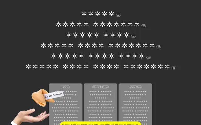
A contemporary grotesque from Dinamo spanning six subfamilies, ten weights and five scripts, with ink trap variants that can be tuned via variable font axes.
About
Designed by Fabian Harb and Johannes Breyer at Dinamo with Erkin Karamemet and Fabiola Mejía, Whyte pairs smooth and sharp stroke transitions in its standard cut, while the Inktrap subfamily repurposes a hot-metal-era printing technique as a visible design feature, deepened or shortened via a dedicated variable axis. The family stretches to Mono and Semi Mono variants, each available with or without ink traps, and all six subfamilies run ten weights from Thin to Super with matching italics. Script coverage extends to Greek, Cyrillic, Hangul and Hebrew, making it one of the more globally prepared grotesques available from a single source.
Classification
Dinamo describe Whyte as a contemporary grotesque with idiosyncrasies; the ink trap variant and smooth/sharp transitions are hallmarks of post-digital grotesque revival design.