Lezen
Diorama Type Partners · Marie-Mam Sai Bellier, Guillaume Sbalchiero · 2023
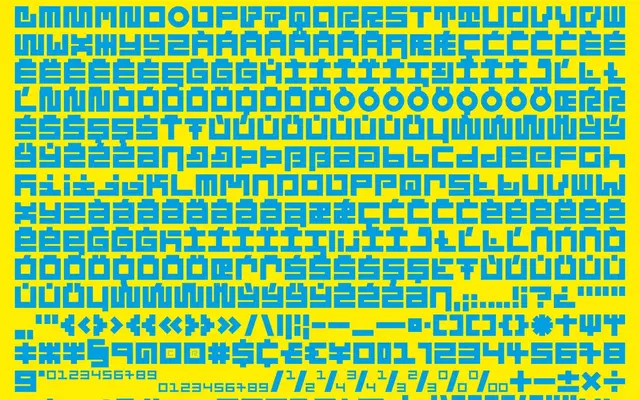
A 44-style layered geometric display family that pays tribute to Dutch designer Jurriaan Schrofer, built for typographic experimentation through superimposed contour layers.
About
Designed by Marie-Mam Sai Bellier and Guillaume Sbalchiero in tribute to the Dutch graphic designer Jurriaan Schrofer and his 1971 work 'Wie dit leest is gek', the family comprises four sub-families (Floor, City, Glow, Optical) each with eleven styles, totalling 44 styles that can be stacked and colour-mixed in layers. More than 400 glyphs per style and four stylistic sets shift the geometric complexity of the letterforms, allowing movement between legibility and sculptural abstraction. The system is designed with 3D translation in mind, reflecting Schrofer's own multidimensional approach to type as material.
Classification
Lezen is a layered, multi-contour geometric typeface designed explicitly for titling and typographic experimentation, with no conventional text-weight application. Its modular, sculptural construction and layer-based system place it firmly in the display category.