Mire
Diorama Type Partners · Marie-Mam Sai Bellier · 2023
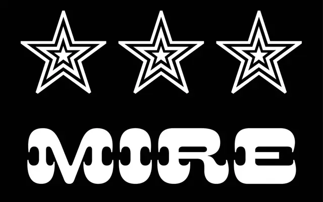
An extra bold display typeface drawn from four 19th-century wood-type letters found in Michael Twyman's history of printing, extended with a large set of contemporary ornament glyphs.
About
Designed by Marie-Mam Sai Bellier between 2019 and 2022, Mire reconstructs a full alphabet from just four letters — M, I, R, E — sourced from a historical survey of print culture, with its defining character residing in the imposing serifs that frame each letterform. The name references both the source letters and the French idiom for having something in one's sights, a play on the display typeface's inherent desire to be seen. Four ornament sets accompany the single weight, allowing the typeface to be built into decorative frames and borders in the manner of Victorian job-printing.
Classification
Mire is a display typeface derived from 19th-century wood-type letterforms, characterised by imposing serifs and extreme boldness typical of the wood-type printing era. It sits firmly in the display category, with ornamental glyphsets reinforcing its decorative, advertising-era heritage.