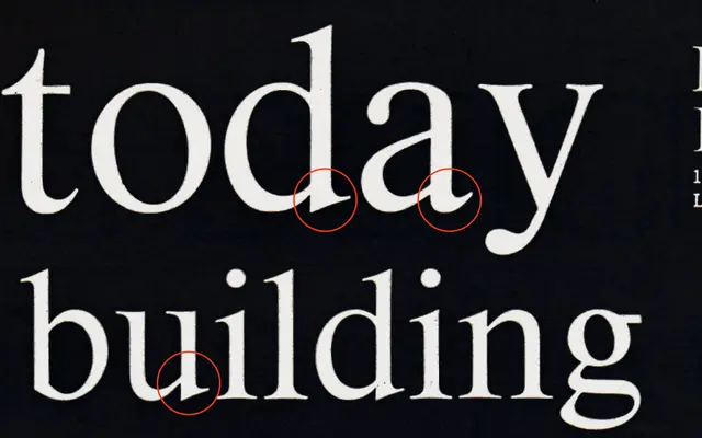
A serif that questions the inherited inconsistencies of typefaces like Times, applying a more unified logic to letterform construction.
About
Starting from the divergent bottom strokes found in letters such as 'a', 'd' and 'u' in Times and similar traditional serifs, Reckless asks why those forms differ and resolves them into a consistent shape. The result is a serif with classical proportions reread through a more analytical, rule-driven approach. It suits editorial and text contexts where a contemporary take on the traditional serif is preferred.
Classification
Reckless takes traditional serif typefaces such as Times as its starting point, reworking their inconsistencies into a more systematic form, placing it within the transitional serif tradition with a contemporary critical lens.