seriftransitional serifitalic
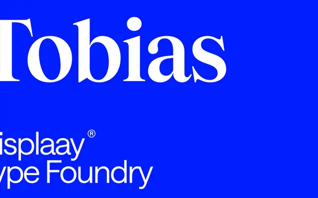
A transitional serif in the Times lineage, spanning eight weights with matching italics and a two-axis variable font covering weight and slant.
About
Tobias sits between Baroque and Transitional in character, taking Times as its primary reference while adding enough contrast and sharpness to work across editorial, book and newspaper contexts. The family runs to 16 styles across eight weights from Thin to Heavy, each with a corresponding italic. A variable font with weight and slant axes allows fine-grained control across the range.
Classification
The page explicitly describes Tobias as sitting between Baroque and Transitional, with a direct reference to Times as its tonal touchstone, placing it firmly in the transitional serif tradition.
Weights
ThinLightRegularMediumSemiBoldBoldExtraBoldHeavy
Languages
Latin
Tags
transitionalbaroqueserifeditorialbooksnewspapersvariabletext