DK Grotesk
sans-serifgrotesqueitalic
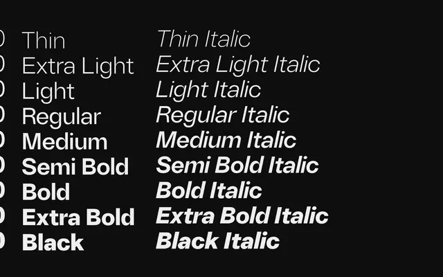
A generic modern grotesque in nine weights with matching italics and a variable font, pitched at digital interfaces and editorial work.
About
Nine weights from Thin to Black, each with an italic, plus a variable font axis make this a broadly usable grotesque family. Character coverage extends through Latin Extended-A and includes standard and discretionary ligatures alongside alternates for a handful of glyphs. The design offers nothing that distinguishes it from dozens of comparable grotesques, but it functions adequately at body and display sizes.
Classification
Positioned as a modern grotesque sans inspired by classic grotesk designs, with the clean geometry and uniform stroke weight typical of the category.
Weights
ThinExtraLightLightRegularMediumSemiBoldBoldExtraBoldBlack
Languages
LatinLatin Extended
Tags
grotesquesans-serifvariableneutralcleanlegiblemodern