DK Play
DK Type · Darman Kadir
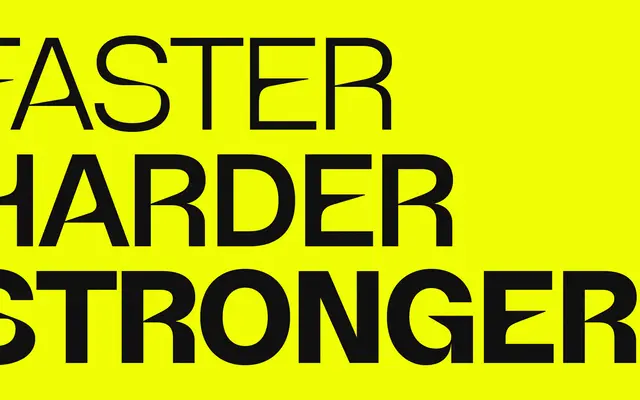
A Swiss-influenced neo-grotesque with eight weights and a variable axis, pitched at sports branding and display work.
About
Designed by Darman Kadir, it takes its formal cues from Helvetica, producing a clean upright construction with even strokes and strong weight contrast across the range. The family runs from ExtraLight to Black with a variable font covering the full axis, and includes OpenType alternates for A, J and O alongside standard ligatures. Its target territory is sports and apparel branding, display headlines and advertising where a solid, neutral grotesque is needed.
Classification
Explicitly draws from Swiss-style typefaces such as Helvetica, placing it firmly in the neo-grotesque tradition with a clean, upright, neutral construction.