Eunomia
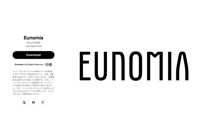
A tall, uppercase-only geometric display face from Japanese foundry Dot Colon, built around simplified letterforms to evoke a science-fiction atmosphere.
About
Originally derived from a logotype published on JAYPEG, Eunomia reduces certain letters such as A, D and P to simplified geometric forms while retaining optical corrections at curves to avoid mechanical stiffness. The family covers three weights — Light, Regular and Bold — with uppercase Latin, numerals and basic symbols only; there are no lowercase characters. Released under a no-rights-reserved licence permitting modification and redistribution without restriction.
Classification
A tall, headline-oriented geometric sans with simplified letterforms and a science-fiction aesthetic, designed purely for display use with uppercase Latin only.