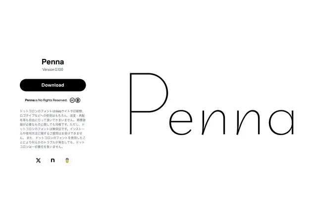
A single-weight geometric sans from Japanese foundry Dot Colon, designed for headlines with a pronounced cap-height contrast and hints of handwritten structure in the lowercase.
About
Built as a display face, Penna pairs a rigorous geometric uppercase — constructed from perfect circles and straight lines with carefully aligned midpoints on letters like E and R — against a lowercase that borrows slightly calligraphic skeletons on characters such as n and f. The result keeps the cleanliness of a geometric sans while avoiding the monotony that single-weight geometric display types often fall into. Available in a single Ultra Light cut under a no-rights-reserved licence, it suits headlines and logotypes where lightness and a touch of playfulness are wanted.
Classification
Explicitly described as a geometric sans-serif with circular forms and straight lines in the uppercase, while lowercase letters incorporate handwritten skeletal forms to avoid monotony.