Tenderness
serifold-style serif
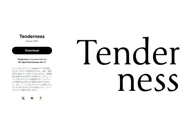
A soft old-style serif from Japanese foundry Dot Colon, built on classical Roman proportions with a raised x-height for improved legibility.
About
Based on the skeleton and stroke modulation of old Roman typefaces, Tenderness aims for a gentle, approachable impression rather than the usual sturdiness of classical revivals. Version 0.601 brings a taller x-height, revised serif shapes and restrained stroke contrast to sharpen readability. Glyph coverage has been expanded significantly to include European diacritical marks, currency symbols and punctuation.
Classification
The designer explicitly references old Roman skeleton and stroke modulation as the structural basis, placing it squarely in the old-style serif tradition.
Weights
Regular
Languages
Latin Extended
Tags
old-styleserifsoftreadablelatinfreeopen-font-license