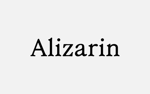
A serif with deliberate hand-drawn asymmetry, referencing the imperfections found in printed matter to give it a contemporary, tactile quality.
About
Alizarin draws on the irregularities of print as a source, building subtle asymmetry into each letterform to avoid the mechanical evenness of conventional digital serifs. The result sits between a refined text face and a display serif, lending warmth and character to editorial or branding contexts where a purely constructed form would feel too cold. Available as a single OTF file and offered free of charge.
Classification
Described as a serif with a hand-drawn quality and subtle asymmetry, drawing on print references; the organic irregularity places it in a hand-drawn serif subcategory rather than a conventional text or display serif.