Lorimer No. 2
sans-serifgrotesquecondenseditalic
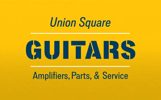
A 1950s-inflected grotesque with boxy curves, slanted terminals and a charming x-height that resists neutrality in favour of character.
About
Built around narrow letters and tight spacing, it is well-suited to headlines, bottle labels and cover designs where large names must fit compressed formats. Five weights with italics span headline to long-copy use across two widths, regular and condensed, giving the family considerable range. A companion stencil cut extends it into display territory with a matching decorative option.
Classification
A mid-century-inflected grotesque sans with boxy curves and slanted terminals, placing it in the broader grotesque tradition with distinctive personality rather than neutrality.
Weights
LightRegularMediumBoldBlack
Optical sizes and widths
standardCondensed
Family
Lorimer No. 2 Condensed
Languages
Latin
Tags
grotesquemid-century1950sdisplayeditorialstencilheadlinespackaging