Sybarite
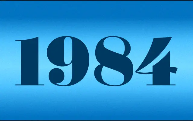
A fat face display type with four optical weights, swash italic capitals and alternate characters designed to resolve the white-space gaps common in the genre.
About
Fat face types traditionally suffer at sizes they were not drawn for, with thin strokes either vanishing or thickening depending on scale. Sybarite addresses this with four optical weights that maintain dramatic stroke contrast across a range of sizes. The italic cuts add a steep slant, sweeping pothook serifs and seven swash capitals, while alternate versions of a, F, R and T are included to prevent the white-space gaps that often plague the genre at display sizes.
Classification
Sybarite is a fat face display type with extreme stroke contrast, pointed serifs and optical size variants — a style rooted in early nineteenth-century British display typography.