Kalev
East of Rome · Jaan Rõõmus, Ana Sanikidze, Fred Wiltshire
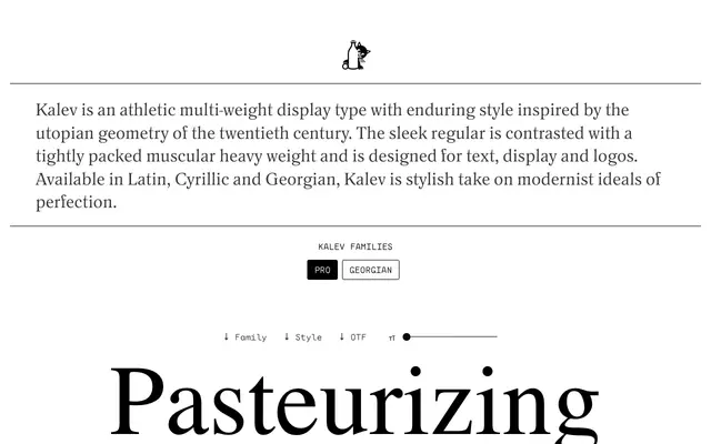
A geometric sans in six weights spanning Latin, Cyrillic and Georgian, rooted in twentieth-century Estonian modernist type and architectural idealism.
About
Designed by Jaan Rõõmus, Ana Sanikidze and Fred Wiltshire, Kalev draws on the utopian geometry of Estonian sans serif tradition, with lighter weights that are formal and spare and heavier weights that compress tightly while opening terminals, a direct reference to photo-type interpretations of geometric faces. Weight names are in Estonian — Vormis through Kogukas — and the family covers 964 characters across two subfamilies, with Georgian included as a gesture toward cultural ties between Estonia and Georgia. Suited to text, display, logos and headlines across a wide range of scripts.
Classification
Rooted in the utopian geometry of twentieth-century modernism with explicit reference to Estonian sans serif architectural idealism and photo-type geometric interpretations; the contrast between sleek light weights and tightly packed heavy weights is characteristic of geometric sans design.