Menhir
East of Rome · Lewis McGuffie
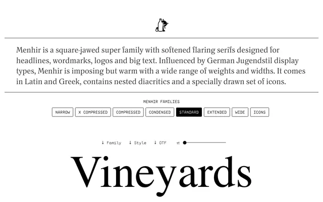
A square-jawed display serif family with softened flaring serifs, spanning seven widths and eight weights, rooted in German Jugendstil types from the turn of the twentieth century.
About
Menhir draws from early Jugendstil display faces including Eckmann-Schrift, Wodan and Block, retaining their imposing presence whilst softening the serifs into a warmer register suited to headlines, wordmarks and large-scale type. The family runs to 57 styles across seven widths from Narrow to Wide, with historical uppercase forms for E, H, M and N that can be swapped via stylistic sets. Coverage extends across Latin and Cyrillic, with nested small-cap diacritics that sit within cap height, and a supplementary icon set drawn by Renée Clarke.
Classification
A square-jawed display serif with flaring, softened serifs drawn from German Jugendstil display types; its imposing weight range and width variety place it firmly in the display category rather than text serif.