Narwa
East of Rome · Lewis McGuffie
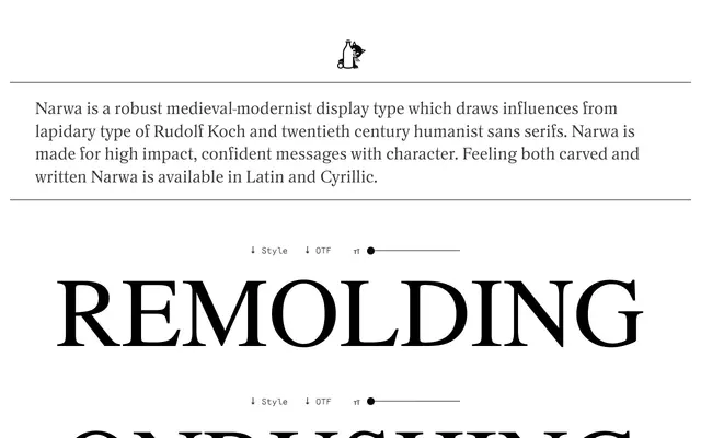
A broad display type by Lewis McGuffie that fuses Rudolf Koch-style lapidary lettering with geometric simplification and photo-type spacing, inspired by a 1920s Narva tour guide.
About
Ten weights run from Thin to Ultra, all sharing a large x-height, generous proportions and stylised jagged cuts that read as both carved stone and written mark. The design draws from Koch's calligraphic traditions but flattens and tightens them with over-close spacing and imposing vertical metrics. Available in Latin and Cyrillic, it suits confident headlines, masthead work and identity projects that call for a historical character without pastiche.
Classification
Narwa draws on lapidary letterforms from Rudolf Koch and humanist sans serifs, resulting in a broad display type with carved, calligraphic qualities and strong geometric simplification. Its high contrast, jagged cuts and vertical stress place it firmly in the display category with a historical medieval inflection.