Bezier
ECAL Typefaces · Chiachi Chao · 2021
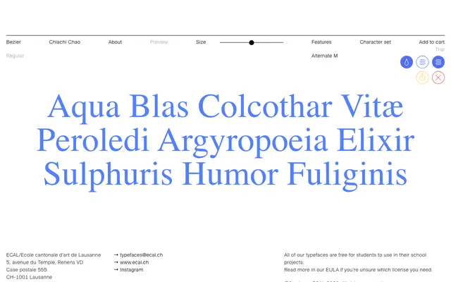
A display typeface by Chiachi Chao built entirely from curves, drawing its letterforms from the organic sculptures of Jean Arp, Henry Moore and Isamu Noguchi.
About
Conceived without a single straight line, each character in Bezier reads as the silhouette of a three-dimensional sculptural form. The interplay of positive and negative space, likened by the designer to the Yin-Yang symbol, gives the typeface a dynamic rhythm and allows it to be set at tight spacing for display use. The result is a typeface that sidesteps nib-drawn letterform convention entirely in favour of a purely plastic, sculptural logic.
Classification
Constructed entirely from curves with no straight lines, the letterforms are sculptural and three-dimensional in character, placing it firmly in the display category with an organic, abstract subcategory.