Hémon
ECAL Typefaces · Chiachi Chao · 2020
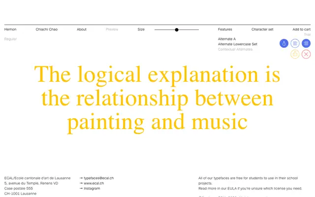
A connecting display script by Chiachi Chao that translates the fragmented, noisy energy of indie rock into irregular letterforms.
About
Designed at ECAL as part of a music-to-typography translation exercise, the typeface embodies the sonic qualities of indie rock through fragmental forms, inconsistent character sizing and connective joints. Vowel alternates prevent any two identical vowels appearing consecutively in the same word, introducing genuine typographic irregularity rather than a simulated one. Suited to large-scale display use where visual rhythm and unpredictability are the point.
Classification
Classified as a display script due to its connecting letterforms and expressive, irregular character construction designed for large-scale setting. Its fragmented, noisy aesthetic draws more from abstract graphic experimentation than calligraphic tradition.