Max Fett
ECAL Typefaces · Weichi He · 2020
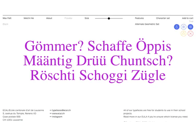
A contemporary interpretation of Fette Grotesk, tracing a lineage through Max Bill's 1930s work back to a Herrlinger & Schmidt source from 1881.
About
Weichi He's single-cut display grotesque draws on the heavy, squarish Fette Grotesk tradition that circulated across German type foundries under several names in the nineteenth and early twentieth centuries. The design acknowledges Max Bill's use of the style during the 1930s for Zett-Haus, and takes the Herrlinger & Schmidt source of 1881 as its primary reference. The result is a bold, compact grotesque suited to headline and poster work where weight and historical resonance are required.
Classification
A heavy, squarish grotesque in the Fette Grotesk tradition, designed for display use at large sizes where its bold weight and geometric rigidity are most effective.