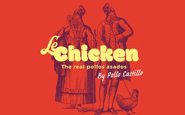
A single-weight Devanagari and Latin display typeface built around extremely heavy, plump letterforms with thin counters and deliberately merging curves.
About
Originally conceived as a hand-sketched lettering experiment exploring legibility at extreme weights in Devanagari, Modak evolved into a full typeface where curves merge into one another to create distinctive counter shapes. Overlapping vowel signs are treated as single drawn entities rather than composites, and every conjunct was individually resolved to maintain consistency across a structurally complex script. EK Type describe it as likely the chubbiest Devanagari typeface designed to date, and it is available as a libre-licensed font with source files on GitHub.
Classification
Modak is explicitly described as a display typeface, designed around very heavy, portly letterforms with thin counters and merging curves, making it unsuitable for text use and firmly in the display category.