Akkordeon
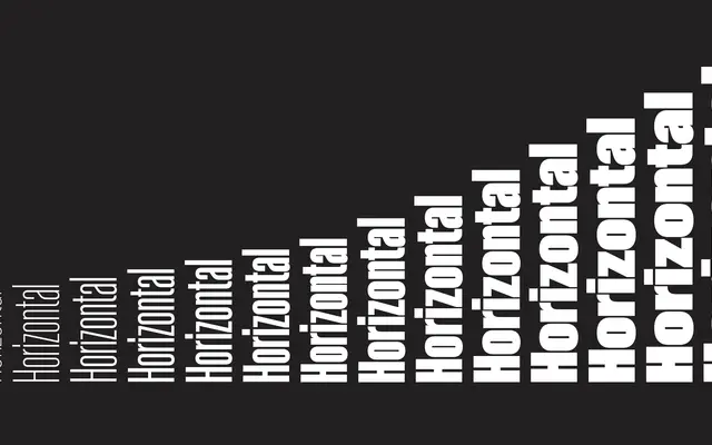
A 15-style display family drawing on 19th and 20th century grotesques, built around a variable breadth from narrow to expanded rather than a conventional weight axis.
About
Rather than stepping through weights in the usual manner, Akkordeon sequences its 15 styles across a continuous gradation of widths, from tightly compressed to fully expanded, giving each step a distinct typographic character. Inspired by grotesques from the XIX and XX centuries, the family is built for short-burst settings: magazine titles, book covers, banners, advertising and branding. A variable font version is available alongside individual style purchases.
Classification
Described as a display font family inspired by grotesques from the XIX and XX centuries, with variable breadth from narrow to expanded. The emphasis on compact, solid headline use places it firmly in the display category with grotesque roots.