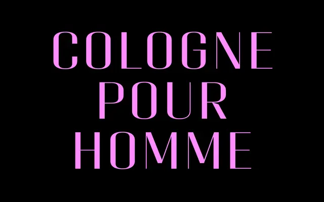
A high-contrast, squarish display typeface drawing on Art Deco proportions with a mechanical edge, designed to pair with Geogrotesque.
About
Six weights from UltraLight to Bold, each with a matching italic, give Classike a versatile range for luxury branding, editorial headers and packaging where refinement and a period flavour are required. The letterforms share their proportions with Geogrotesque, lending the family a geometric rigour beneath its decorative surface. A variable font covering the full weight axis is included with the family purchase.
Classification
High contrast, squarish letterforms with a mechanical quality and strong vertical stress place this firmly in the display category; the Art Deco inspiration and geometric underpinning distinguish it from standard high-contrast serifs.