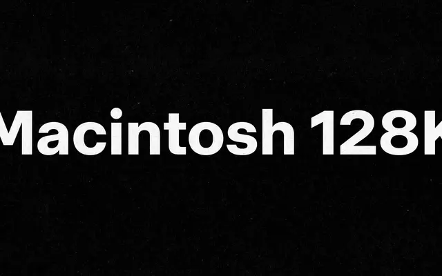
A neo-grotesque workhorse with Swiss style roots and industrial character, offered across 10 weights with matching italics and a variable font.
About
Built on a high x-height and loose width proportions with compact verticals, Decagram sits between Swiss rationalism and a more industrial sensibility. Distinctive details include a high vertex in the M, a narrow J, rounded punctuation dots and sporty figures that prevent it from feeling entirely neutral. The 21-style family, including a variable font, covers a wide weight range from Thin to UltraBlack with full italic support throughout.
Classification
Described by the foundry as a neo-grotesque with Swiss style influence, placing it firmly in the grotesque sans-serif tradition with industrial undertones rather than humanist or geometric tendencies.