sans-serifsemi-condensed grotesqueitalic
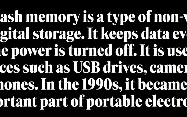
A semi-condensed grotesque drawn from the headline typography of 1970s and 1980s technology magazines and advertising print.
About
Tall proportions and slightly tight spacing give Eternia the dense, vertical texture of period headlines without tipping into outright pastiche. Controlled contrast and a semi-condensed width make it compact enough for heavy display use while remaining readable across weights from ExtraLight to Black. Sixteen styles include matching italics and variable font files for both roman and italic axes.
Classification
Tall proportions, semi-condensed width and controlled contrast place it squarely in the grotesque sans-serif tradition, with a vertical emphasis reminiscent of headline typefaces from 1970s–80s technology and advertising print.
Weights
ExtraLightLightRegularMediumSemiBoldBoldBlack
Languages
Latin Extended
Tags
grotesquesemi-condensedheadlineretroeditorialadvertising1970s1980s