Inklination
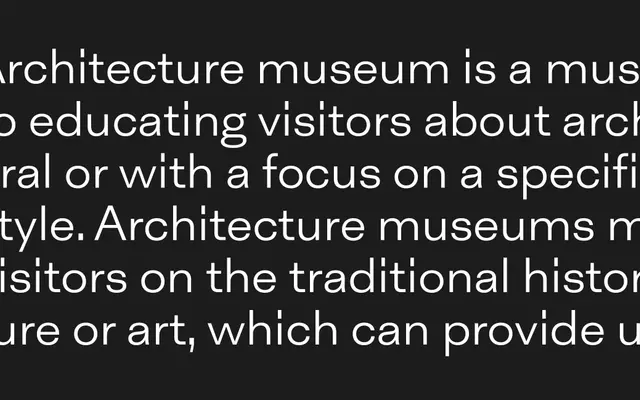
A grotesque sans with a deliberately low x-height and two sets of italics at 10° and 20° inclination, plus a five-weight monospaced companion.
About
Inklination breaks from contemporary grotesque conventions by adopting a low x-height paired with long ascenders and descenders, lending the text a light, airy quality suited to luxury and editorial applications. The family offers two italic cuts: a standard 10° inclination and a more aggressive 20° brutalist variant, giving designers meaningful tonal range within a single family. A five-weight monospaced subfamily rounds out the 20-font release.
Classification
Described explicitly as a grotesque, departing from genre conventions with a low x-height and long ascenders and descenders, placing it firmly in the grotesque sans-serif tradition.