Relato Serif
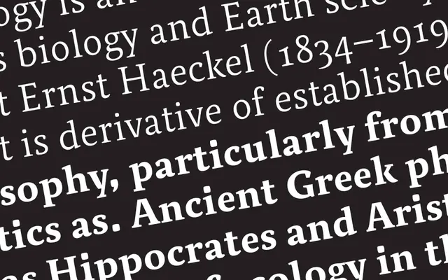
A humanist serif with low contrast and calligraphic roots, drawing on Renaissance capitals and humanist handwriting for text and display use.
About
Combining a muscular, low-contrast structure with a variety of terminal strokes and the interplay of curves and semi-straight lines, it reads comfortably in long text while revealing more personality at display sizes. The uppercase draws on Renaissance roman capitals and the lowercase on humanist handwriting, giving the face a warmth that sits apart from more mechanical serifs. Five styles cover Regular, Regular Italic, Small Caps, SemiBold and Bold, all with broad Latin Extended glyph coverage including ligatures, fractions and super- and subscripts.
Classification
Low contrast and muscular structure with terminals and curves drawn from humanist calligraphic traditions; uppercase based on Renaissance roman capitals and lowercase on humanist handwriting, placing it firmly in the humanist serif subcategory.