Merkur
EPI · 2017
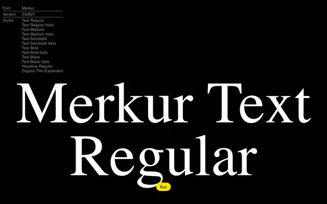
A transitional serif begun in a type design seminar under Jovica Veljović, drawing on Baroque Antiqua specimens to push back against the formal austerity of Neoclassicism and Modernism.
About
Originated in 2017 in a seminar led by Jovica Veljović, Merkur takes the transitional serif as an opportunity to celebrate formal variety rather than rationalist reduction. Its references span Romain du Roi, Baskerville, Caslon, Janson, Sabon and Galliard, alongside contemporary typefaces such as Ogg and Till, giving it a historically informed but present-minded character. Three optical registers, Text, Headline and Display, move the family from restrained body setting through to attention-seeking expressivity.
Classification
Merkur is explicitly described as a Baroque Antiqua or Transitional Serif, positioned between Renaissance calligraphic styles and Neoclassical construction, with direct references to Baskerville, Janson, Caslon and other canonical transitional models.