Chamberí
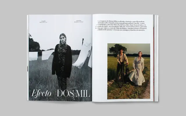
A 56-style editorial serif designed as the bespoke typeface for Vogue España, spanning four optical sizes from functional text to flamboyant superdisplay.
About
Commissioned as a bespoke typographic identity for Vogue España, Chamberí merges the functional structure of 19th-century Scotch Romans with the gestural expressiveness of typographic Baroque. Contrast increases progressively across the four optical sizes — Text, Headline, Display and SuperDisplay — each offered in seven weights from ExtraLight to Black with matching italics. Small caps and old-style figures are included throughout, giving the family the editorial depth expected of a major magazine branding commission.
Classification
Chamberí blends the high-contrast rationalism of 19th-century Modern Romans (Scotch typefaces) with the gestural quality of typographic Baroque, placing it firmly in the modern serif tradition with expressive display ambitions.