Correct Condensed
Feliciano Type · 2023
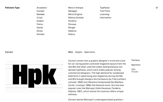
A flat-sided condensed grotesque in five widths and six weights, drawing on the proportional calm of Aldo Novarese's overlooked Metropol to update the bold commercial condensed style of the 1960s.
About
Rooted in car racing posters and bold magazine layouts of the late 1960s, it takes particular cues from Metropol's even proportions and gentle curves rather than the more celebrated Compacta or Helvetica Compressed. One weight axis runs across five widths from Condensed to XXXX Condensed, each with matching italics, giving twelve styles per sub-family. The result sits between display work and strong editorial moments without tipping into pastiche.
Classification
A flat-sided condensed grotesque sans inspired by mid-century commercial typefaces such as Compacta and Metropol; its tight proportions, even width variants and mechanical-yet-human character place it firmly in the condensed grotesque tradition.