Garda Nova
Feliciano Type · 2004
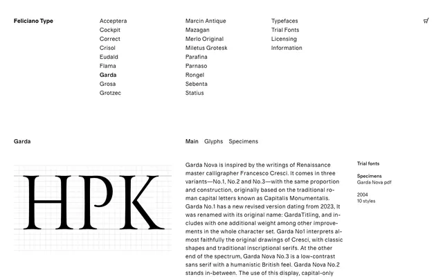
A capital-only display family in three variants, ranging from high-contrast inscriptional serifs faithful to Francesco Cresci's Renaissance calligraphy to a low-contrast humanist sans.
About
Rooted in the writings of Renaissance calligrapher Francesco Cresci and the Capitalis Monumentalis tradition, Garda Nova spans three numbered variants sharing the same underlying proportions and construction. No.1 (now revised and renamed Garda Titling) adheres closely to Cresci's original drawings with traditional inscriptional serifs; No.3 strips the contrast for a sans with a humanistic British character; No.2 occupies the middle ground. Ten styles across the collection have found use in architectural lettering, luxury packaging and refined stationery.
Classification
A capital-only display family derived from Renaissance calligraphy and Capitalis Monumentalis letterforms, spanning from high-contrast inscriptional serif to low-contrast humanist sans across three numbered variants.