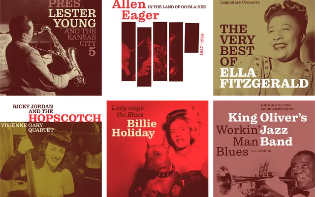
A Clarendon-style slab built on a Century Schoolbook skeleton, designed for legibility at small sizes in both print and on screen.
About
Pulpo draws on two familiar traditions: the sturdy bracketed serifs of Clarendon and the warm, rounded skeleton of Century Schoolbook. Extended ascenders and descenders give running text more breathing room, while a large x-height and low stroke contrast keep it readable on newsprint and screen alike. Five weights from Light to Black, each with a matching italic, make it flexible across editorial, advertising and packaging contexts.
Classification
Pulpo is explicitly described as a Clarendon-style typeface with low stroke contrast and bracketed serifs, making it a clear slab serif in the Clarendon subcategory. The Century Schoolbook skeleton gives it a rounded, text-friendly quality typical of that tradition.