Tuna
Flood Fonts · Felix Braden and Alex Rütten
A screen-optimised humanist serif by Felix Braden and Alex Rütten, built around calligraphic principles and low stroke contrast for sustained reading on digital devices.
About
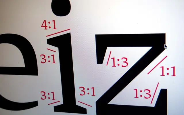
Tuna takes its design cues from steep-angle historical scripts such as Carolingian minuscule and the horizontal emphasis of Roger Excoffon's Antique Olive, translating those principles into a contemporary body text face. Large counters, a generous x-height, squared curves and near-equal vertical and horizontal stroke weights help glyphs sit cleanly on a rasterised grid without distorting their outlines. Manual TrueType hinting by Jan Gerner (Yanone) rounds out the screen optimisation, targeting the 9–14 point range for ClearType and DirectWrite rendering.
Classification
Tuna draws on broad-nib calligraphic tradition with a steep pen angle and low stroke contrast, placing it firmly in the humanist serif camp. Its screen-optimisation rationale and historical references to Carolingian minuscule and Antique Olive further distinguish it from classical or transitional serifs.