Kernevel Black
Fonderie Bretagne · Lucas Le Bihan · 2020
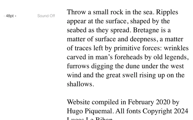
A single heavy display weight by Lucas Le Bihan, rooted in the textures and atmosphere of the Breton coastline.
About
Kernevel Black is the heaviest cut from Fonderie Bretagne's Kernevel family, designed by Lucas Le Bihan. The foundry frames the work around the landscape of Bretagne, invoking the physical traces left by wind, tide and legend on the land and its people. As a standalone Black weight, it is positioned for display and editorial use where visual weight and regional character matter.
Classification
The name and foundry context suggest a bold display weight with strong character; the poetic coastal imagery and 'Black' weight designation point to a high-contrast display serif intended for expressive, large-scale use.