Kernevel Black Italic
Fonderie Bretagne · Lucas Le Bihan · 2020
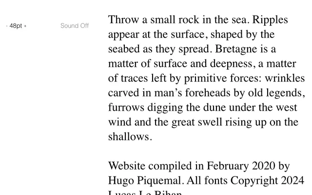
A heavy italic display serif from Lucas Le Bihan, drawing on the rugged coastal landscape of Brittany for its expressive character.
About
Kernevel Black Italic is the boldest and most inclined cut of Lucas Le Bihan's Kernevel family, designed for high-impact display use. The foundry's poetic framing positions the typeface within the geology and folklore of Brittany, suggesting a design sensibility shaped by natural forces rather than mechanical precision. Best suited to editorial headlines, poster work and cultural projects where weight and personality are required.
Classification
The heavy Black weight and italic cut, combined with its expressive coastal-inspired character, places this firmly in the display category rather than text use.