Self Modern Regular
Fonderie Bretagne · Lucas Le Bihan · 2024
serifmodern serif
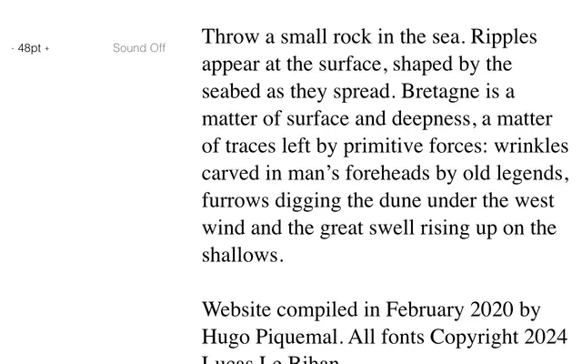
A modern serif by Lucas Le Bihan, designed under the Fonderie Bretagne imprint with the clean vertical contrast of the neoclassical tradition.
About
Released in 2024 by Lucas Le Bihan, Self Modern Regular sits within the Didone or neoclassical modern serif tradition, characterised by high stroke contrast and rational structure. Fonderie Bretagne positions the work within a broader concern with surface and depth, drawing on the textures of the Breton landscape as a conceptual frame. Available as a single regular weight.
Classification
The name 'Modern Regular' signals a Didone or neoclassical modern classification, characterised by high stroke contrast and vertical stress typical of the modern serif genre.
Weights
Regular
Languages
Latin
Tags
moderndidoneseriffrencheditorialhigh-contrast