Chopin
Fontfabric · Svetoslav Simov · 2024
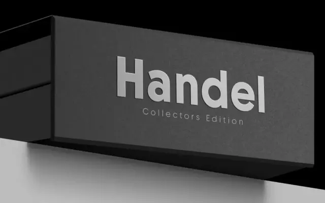
A geometric sans with a rhythmic alternation of wide and narrow proportions, designed by Svetoslav Simov at Fontfabric and released in 2024.
About
Designed by Svetoslav Simov with Viktoria Usmanova as type director, Chopin draws from vintage poster and book title lettering to produce a sans-serif with an energetic push and pull between wide and narrow letterforms. The family spans nine weights from Hairline to Black with matching italics, plus two variable fonts covering the full Roman and Italic axes. Extended Latin, Cyrillic and Greek coverage, alongside OpenType features including ligatures, contextual alternates and old-style figures, makes it well suited to editorial titles, packaging and branding work.
Classification
Chopin is a low-contrast geometric sans-serif with a distinctive rhythmic axis alternating wide and narrow letterforms, placing it firmly in the geometric sans tradition with expressive proportional variation.