Gilam
Fontfabric · Plamen Motev, Ivan Petrov · 2018
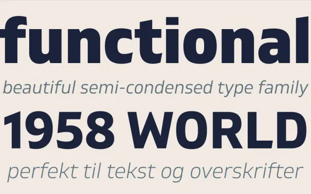
A DIN-influenced neo-grotesque with semi-condensed proportions, sharp edge details and broad multilingual coverage across 18 styles.
About
Designed by Plamen Motev and Ivan Petrov and released in 2018, Gilam draws on the DIN grotesque tradition while adding its own details: sharp cuts on the W and M, outward-facing terminals and a prominent x-height that aid readability at screen and print sizes. The family spans nine weights from Thin to Black, each with a matching italic, and covers Latin Extended, Cyrillic and Greek scripts. Suited to editorial layouts, UI work, packaging and signage where a controlled, slightly condensed sans is required.
Classification
Inspired by the DIN neo-grotesque tradition with semi-condensed proportions, geometric clarity and sharp edge details; Fontfabric explicitly positions it within the DIN lineage while adding warmer terminal treatments.